How to use Tailwind CSS with TakeShape
What we're building
In this tutorial we're going to build a job board site using Tailwind CSS, Next.js, and TakeShape.


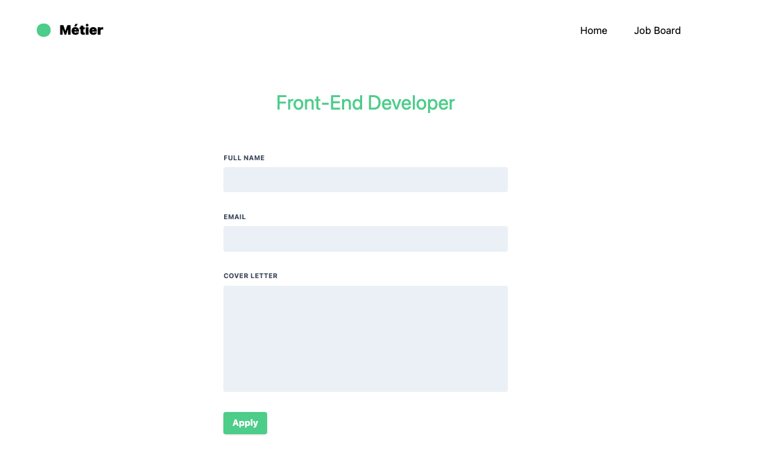
You can view the finished project here and the Github repo here.
What is Tailwind CSS?
Tailwind CSS is a utility-first CSS framework for rapidly building custom user interfaces. It's a highly customizable, low-level CSS framework that gives you all of the building blocks you need to build without any opinionated styles.
Traditionally, whenever you need to style something on the web, you write CSS.
<h1 class="title">Regular CSS</h1>.title {
color: red;
}With Tailwind, you style elements by applying pre-existing classes directly in your HTML.
<h1 class="text-red-500">Tailwind</h1>You might be thinking, this is quite ugly and feels like an atrocity. But there are several good reasons for why you want to use this over regular CSS.
- You're not wasting time inventing class names: Naming things might be one of the hardest things to do. With Tailwind, no more adding silly class names like
main-button-containerjust to be able to style something. - Your CSS stops growing: Using a traditional approach, your CSS files get bigger every time you add a new feature. With utilities, everything is reusable so you rarely need to write new CSS.
- Making changes feels safer: CSS is global and you never know what you're breaking when you make a change. Classes in your HTML are local, so you can change them without worrying about something else breaking.
Getting started with TakeShape
TakeShape offers new and more instant, intuitive, adaptable, and collaborative services to power JAMstack projects.
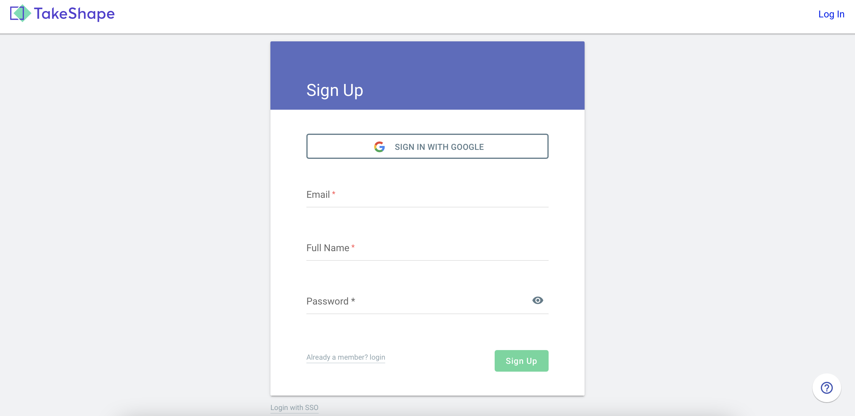
Create a TakeShape account (it's free)
Sign up for a free developer account. Every project you create gets:
- Up to 3 team members
- 1 static site
- 2 locales
- Unlimited content types
- 500 content entries
- Webhooks
- Community support
- 10GB of bandwidth, 10GB of file storage, and up to 10,000 API requests
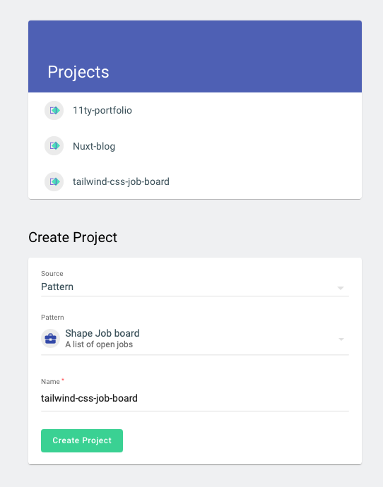
Create a new content project
Under Pattern, select Shape Job Board and go ahead and give it a cool name. I'll call mine something generic like Tailwind-CSS-Job-Board.
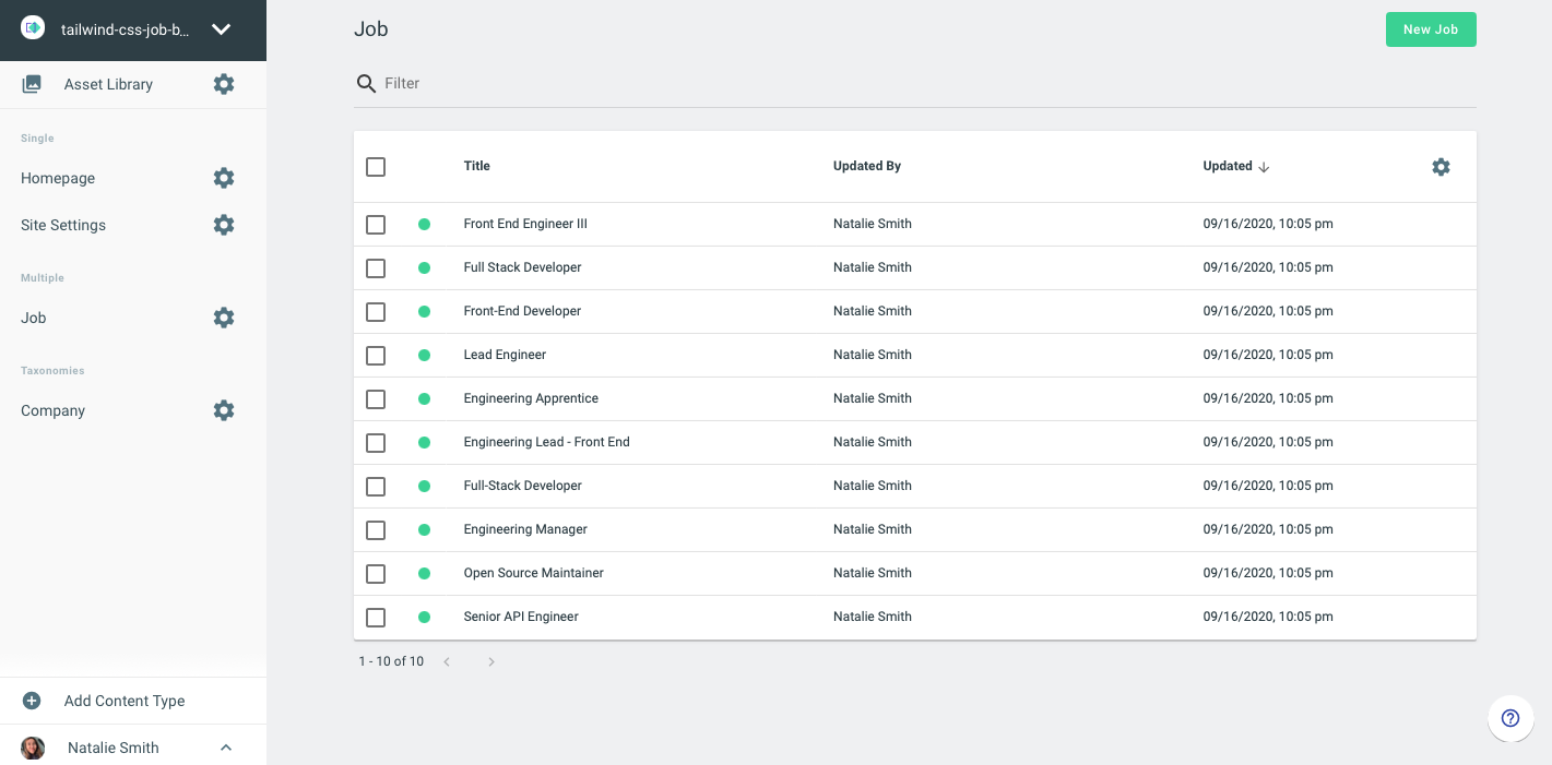
Let's create our API keys
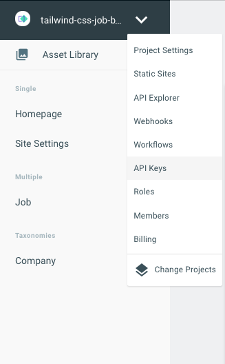
Click the dropdown menu to select API Keys.
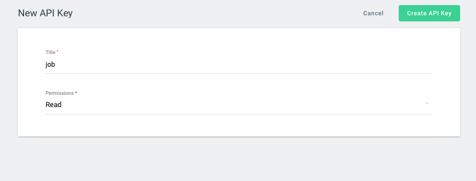
Since we're using it on the client side without any authentication, I'm going to set it to read only.
Prerequisite
- HTML, CSS and JavaScript basics
Setting up the Project
First, let's setup a Next.js project. To do that, we're going to use Next's create-next-app to bootstrap our project. Open up your terminal and run the following command:
npx create-next-app
# or
yarn create next-app
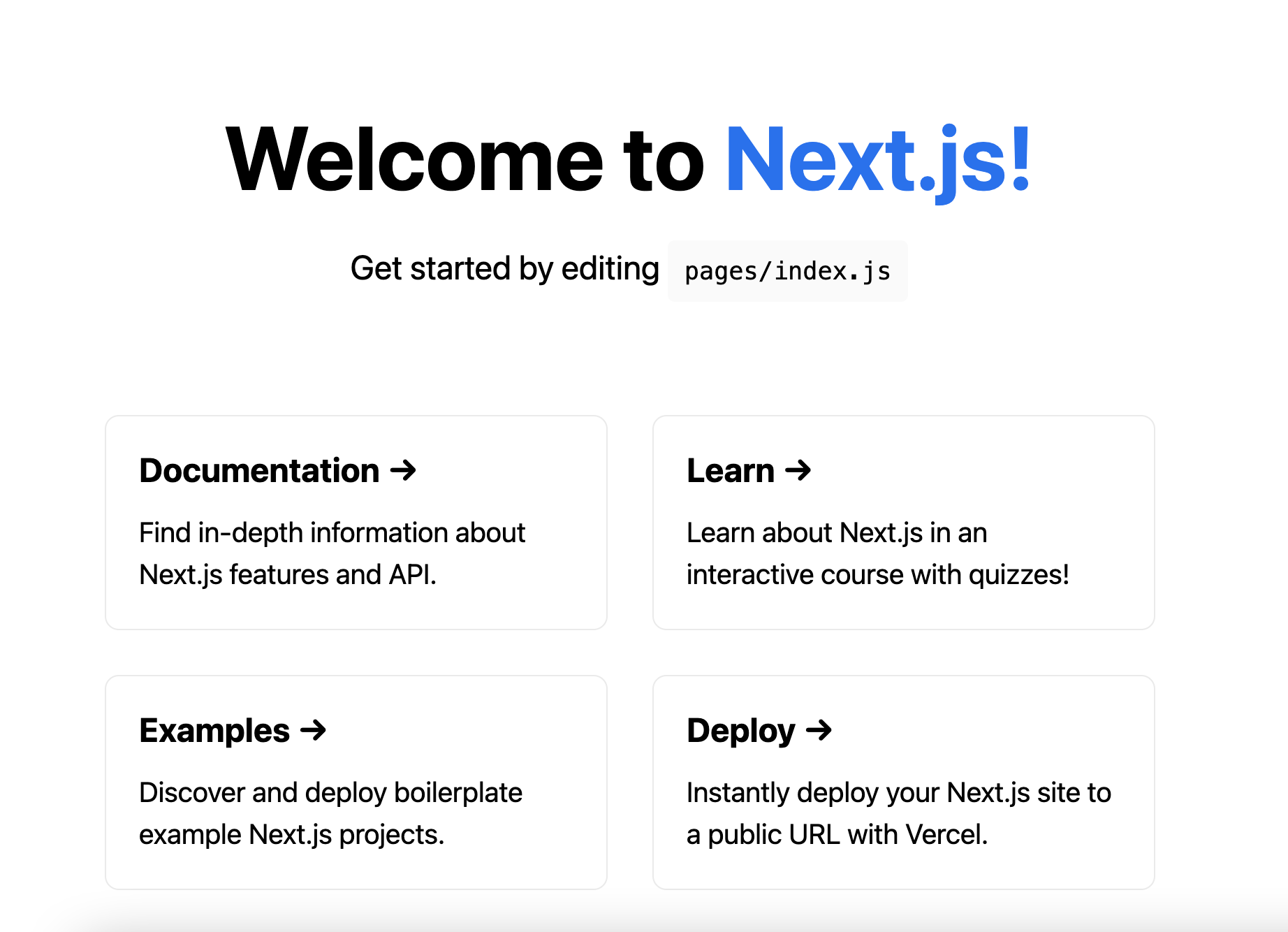
After that, run npm run dev in your terminal and head to localhost:3000
Adding Tailwind CSS
Now, we need to install Tailwind as a CSS dev dependency.
npm install tailwindcss postcss-preset-env -D
# or
yarn add tailwindcss postcss-preset-env -D
Next we need to create the Tailwind configuration file. In your terminal, run the following command:
npx tailwindcss initIn the tailwind.config.js file, add all the React component files in the purge property. For this we will add all the files in the pages and components folders.
module.exports = {
  purge: ["./pages/**/*.js", "./src/components/**/*.js"],
  theme: {
    extend: {},
  },
  variants: {},
  plugins: [],
};
Next, we need to create the root CSS file where we will import Tailwind CSS. In the styles folder, create a file called index.css.
@tailwind base;
@tailwind components;
@tailwind utilities;
After that we need to import the CSS to our application. In Next.js we have to do this in the _app.js file, which is created in the pages directory.
import "../src/styles/index.css";

const MyApp = ({ Component, pageProps }) => {
  return <Component {...pageProps} />;
};

export default MyApp;
Next, we need to setup PostCSS to include Tailwind CSS. In the project root, create a postcss.config.js file.
module.exports = {
  plugins: ["tailwindcss", "postcss-preset-env"],
};
Finally, we need to update the Tailwind configuration to look through all of our project files for Tailwind classes.
In your tailwind.config.jsfile, add the following:
module.exports = {
  future: {
    removeDeprecatedGapUtilities: true,
  },
  purge: ['./components/**/*.{js,ts,jsx,tsx}', './pages/**/*.{js,ts,jsx,tsx}'],
  theme: {
    extend: {
      colors: {
        'accent-1': '#333',
      },
    },
  },
  variants: {},
  plugins: [],
};
Now, let's test this out. In pages/index.js, add the following:
import Head from 'next/head';

function Home() {
  return (
    <div>
      <Head>
        <title>TakeShape Tailwind CSS </title>
        <link rel='icon' href='/favicon.ico' />
      </Head>

      <section>
				<h1 className='text-indigo-600 p-4 text-xl'>Hello World!</h1>
			</section>
    </div>
  );
}

export default Home;
This should apply an indigo color to our text "Hello World" and if we save it, you should see it reflect in the browser. See the full list of text colors here.

Tailwind Basics
To get a feel for Tailwind, let's build something small and break it down. For this, we're going to build a button.

Here's the markup for this button:
<button class="bg-blue-500 hover:bg-blue-700 text-white font-bold py-2 px-4 rounded">
  Button
</button>
And here's the corresponding css for each of the class names.
- bg-blue-500 -
background-color: #4299e1; - hover:bg-blue-700 - On hover,
background-color: #2b6cb0; - text-white -
color: #FFF; - font-bold -
font-weight: bold; - py-2 -
padding-top: 1rem; padding-bottom: 1rem; - px-4 -
padding-left: 1rem; padding-right: 1rem; - rounded -
border-radius: 0.25rem;
Now that we know a little bit more about Tailwind, let's go and build the landing page.
Building the landing page
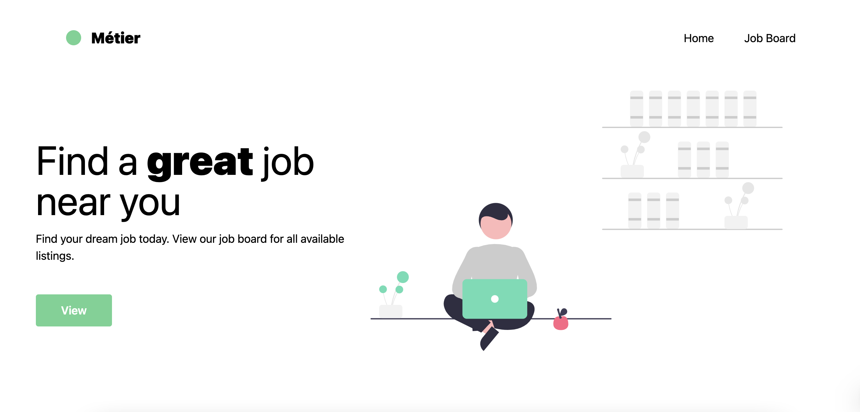
Now, we need to create the landing page. First, we're importing the navbar from the components folder which you'll build in the next section. Then, we're creating a container to put our heading, sub-heading, button, and svg illustration. Lastly, we're using various Tailwind classes to customize the font, width, height, etc.. in combination with Flexbox to make it responsive.
Inside the pages directory, in the index.js file, add the following:
import Head from 'next/head';
import Link from 'next/link';

import Navbar from '../components/Navbar';
import LandingIllustration from '../assets/project-team.svg';

function Home() {
  return (
    <div>
      <Head>
        <title>TakeShape Tailwind CSS </title>
        <link rel='icon' href='/favicon.ico' />
      </Head>

      <section>
        <main className='bg-white font-montserrat'>
          <Navbar />

          <div className='container mx-auto flex flex-col-reverse sm:flex-row items-center'>
            <div className='sm:w-2/5 flex flex-col items-start mt-8 sm:mt-0'>
              <h1 className='text-4xl lg:text-6xl leading-none mb-4'>
                Find a <strong className='font-black'>great</strong> job near
                you
              </h1>
              <p className='lg:text-lg mb-4 sm:mb-12'>
                Find your dream job today. View our job board for all available
                listings.
              </p>

              <Link href='/job-board'>
                <button className='font-semibold text-lg bg-green-400 hover:bg-green-500 text-white py-3 px-10 rounded'>
                  View
                </button>
              </Link>
            </div>
            <div className='sm:w-1/5 mb-10'>
              <div className='m-5'>
                <LandingIllustration />
              </div>
            </div>
          </div>
        </main>
      </section>
    </div>
  );
}

export default Home;
Building the Navbar
In this section, we're going to build out the Navbar. Since we're going to need to use the navbar in multiple pages, we should make it into a component. Utilizing Tailwind's classes, we're using Flexbox to act as the container and to arrange items. Then, we're using various Tailwind classes to customize the color, font-family, width, height, and more of the items in the navbar. Lastly, we're using Next's Link component to link to other pages like the index page and the job board page.
At the root of your project, create a folder called components and a file called Navbar.js. Add the following:
import Link from 'next/link';

const Navbar = () => {
  return (
    <section>
      <header className='h-24 sm:h-32 flex items-center'>
        <div className='container mx-auto px-6 sm:px-12 flex items-center justify-between'>
          <div className='text-black font-black text-2xl flex items-center'>
            <span className='w-6 h-6 rounded-full bg-green-400 mr-4'></span>
            <Link href='/'>Métier</Link>
          </div>
          <div className='flex items-center'>
            <nav className='text-black text-lg hidden lg:flex items-center'>
              <Link href='/'>
                <a className='py-2 px-6 flex hover:text-green-400'>Home</a>
              </Link>
              <Link href='/job-board'>
                <a href='#' className='py-2 px-6 flex hover:text-green-400'>
                  Job Board
                </a>
              </Link>
            </nav>
          </div>
        </div>
      </header>
    </section>
  );
};

export default Navbar;
If we click on the View button, we're supposed to be taken to the job-board page, so, let's create that page. In your pages folder, create a file called job-board.js and add the following:
import Navbar from '../components/Navbar';

const JobBoard = () => {
  return (
    <section>
      <Navbar />
		<h1>JobBoard</h1>
    </section>
  );
};

export default JobBoard;
Now we need some data to populate our job-board page. For this, we're going to use Apollo Client to fetch our data and supply it to our Next.js application.
Data Fetching
First, we need to install some dependencies. In your terminal, install the following:
npm i @apollo/react-hooks apollo-boost graphql next-with-apollo
# or
yarn add @apollo/react-hooks apollo-boost graphql next-with-apollo
At the root of your project, create a folder called lib and create a file called withApollo.js and add the following:
In the withApollo.js file, we're creating a High Order Component to create a basic setup with Apollo Boost to use Apollo with Next.js. Then, we're wrapping the whole app with the ApolloProvider component which will give us access to query to TakeShape in any pages or components in our project.
import withApollo from 'next-with-apollo';
import ApolloClient, { InMemoryCache } from 'apollo-boost';
import { ApolloProvider } from '@apollo/react-hooks';

export default withApollo(
  ({ initialState }) => {
    return new ApolloClient({
      uri:
        `https://api.takeshape.io/project/${process.env.TAKESHAPE_ID}/graphql`,
      cache: new InMemoryCache().restore(initialState || {}),
      headers: {
        authorization: `Bearer ${process.env.TAKESHAPE_KEY}`,
      },
    });
  },
  {
    render: ({ Page, props }) => {
      return (
        <ApolloProvider client={props.apollo}>
          <Page {...props} />
        </ApolloProvider>
      );
    },
  }
);
Environment Variables
Next.js comes with built-in support for environment variables, so we don't need to install a third party library for this.
To use environment variables in Next.js, we're going to create a file called .env.local which will load all the variables into process.env. In addition, since we're making a GET request in the browser, .env.local will only load the environment variables in a Node.js environment. In order to expose a variable to the browser you have to prefix the variable with NEXT_PUBLIC_
At the root of your project, create a file called .env.local and add the following:
NEXT_PUBLIC_TAKESHAPE_ID="<YOUR TAKESHAPE PROJECT ID>"
NEXT_PUBLIC_TAKESHAPE_KEY="<YOUR TAKESHAPE API KEY>"
Now, we need to wrap our whole app so we can fetch all the jobs in our job-board.js file. To do that, head into the pages folder and in the _app.js file add the following:
import '../styles/index.css';

import withApollo from '../lib/withApollo';

function MyApp({ Component, pageProps }) {
  return <Component {...pageProps} />;
}

export default withApollo(MyApp);
Go back to the pages/job-board.js and update it so we can fetch jobs from TakeShape. Add the following:
import gql from 'graphql-tag';
import { useQuery } from '@apollo/react-hooks';

import Navbar from '../components/Navbar';

const QUERY = gql`
  {
    getJobList {
      items {
        _id
        title
        body
        hotJob
        company {
          name
        }
      }
    }
  }
`;

const JobBoard = () => {
  const { loading, data } = useQuery(QUERY);
	if(!loading) {
		console.log(data)
	}
  return (
    <div>
      <Navbar />
    </div>
  );
};

export default JobBoard;
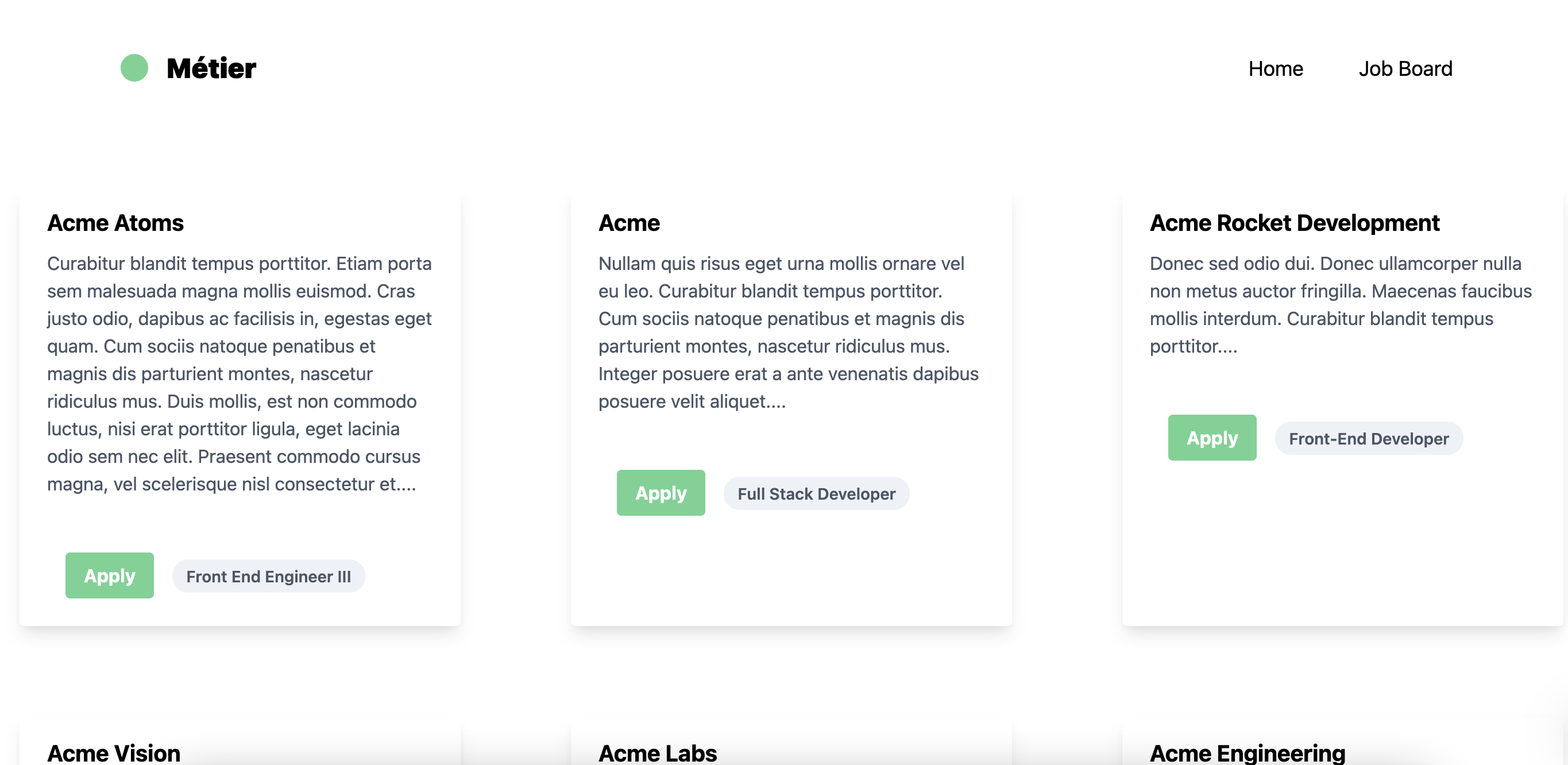
If you open your console in the browser, you should see the data. Now, let's build a card component to display the title, description, etc...
In your components folder, create a new file called Card.js and add the following:
const Card = ({ allJobs }) => {
  const { items } = allJobs.getJobList;

  return (
    <section className='grid grid-cols-3'>
      {items.map((job) => {
        return (
          <div
            className='max-w-sm rounded overflow-hidden shadow-lg m-10'
            key={job._id}
          >
            <img
              className='w-full'
              src='https://9to5mac.com/wp-content/uploads/sites/6/2018/02/logo.jpg?quality=82&strip=all'
              alt='Sunset in the mountains'
            />
            <div className='px-6 py-4'>
              <div className='font-bold text-xl mb-2'>{job.company.name}</div>
              <p className='text-gray-700 text-base'>
                {job.body.blocks[0].text}...
              </p>
            </div>
            <div className='px-6 pt-4 pb-2'>
              <span className='inline-block bg-gray-200 rounded-full px-3 py-1 text-sm font-semibold text-gray-700 mr-2 mb-2'>
                {job.title}
              </span>
              <span className='inline-block bg-gray-200 rounded-full px-3 py-1 text-sm font-semibold text-gray-700 mr-2 mb-2'>
                #money
              </span>
              <span className='inline-block bg-gray-200 rounded-full px-3 py-1 text-sm font-semibold text-gray-700 mr-2 mb-2'>
                #location
              </span>
            </div>
          </div>
        );
      })}
    </section>
  );
};

export default Card;
Now go back to the job-board.js file and update it so we can pass the data into the Card component as a prop.
import gql from 'graphql-tag';
import { useQuery } from '@apollo/react-hooks';

import Navbar from '../components/Navbar';
import Card from '../components/Card';

const QUERY = gql`
  {
    getJobList {
      items {
        _id
        title
        body
        hotJob
        company {
          name
        }
      }
    }
  }
`;

const JobBoard = () => {
  const { loading, data } = useQuery(QUERY);

  return (
    <div>
      <Navbar />
      {loading ? <h1>Loading...</h1> : <Card allJobs={data} />}
    </div>
  );
};

export default JobBoard;
In the next section, we're going to learn more about dynamic routes in Next.js. In our Card component, we want to be to click on a specific job listing and be taken to that job page. For this, we need to be able to create a dynamic slug (localhost:3000/1234) and a template to display what every dynamic page should look like.
Dynamic Routes
Defining routes by using predefined paths can be tedious and is not always enough for complex applications. In Next.js you can add brackets to a page ([id]) to create a dynamic route (a.k.a. url slugs, pretty urls, and others).
Every time we click on the apply button in the Card.js file, we want to be taken to the apply page. For this, we need dynamic routes, which will create a new page based on the dynamic data we pass in to Next's router.

To create a dynamic route, first, we need to import the Link component from Next. Then, we need to wrap the Link component around the item that we want to be able to click on. In this case, we would wrap it around the Apply button. The Link component has a couple of props that we can use:
pathname- This will define the structure of the dynamic route. Let's say we want the url to look something like this: localhost:3000/post/<id>. To achieve that, you would put this: <Link href="/post/[id]"/>. For this project, we want the route to look something like this: localhost:3000/<id>.query- This allows you to pass in props to your dynamic route page (_id.js) For this, we're passing in the job title as a prop to the_id.jspage so we can display the job title in the apply page.as- This allows you to define what the dynamic route is. In our case, we're passing in the id coming from TakeShape.
In your Card.js file add the following:
import Link from 'next/link';

const Card = ({ allJobs }) => {
  const { items } = allJobs.getJobList;
  return (
    <section className='grid grid-cols-3'>
      {items.map((job) => {
        return (
          <div
            className='max-w-sm rounded overflow-hidden shadow-lg m-10'
            key={job._id}
          >
            <div className='px-6 py-4'>
              <div className='font-bold text-xl mb-2'>{job.company.name}</div>
              <p className='text-gray-700 text-base'>
                {job.body.blocks[0].text}...
              </p>
            </div>

            <div className='px-6 pt-4 pb-2'>
              <Link
                href={{ pathname: '/[id]', query: { title: job.title } }}
                as={`/${job._id}`}
              >
                <button className='bg-green-400 hover:bg-green-500 text-white font-bold py-2 px-4 rounded m-4'>
                  Apply
                </button>
              </Link>
              {/* <Link href='/[id]' as={`/${job._id}`}>
                <button className='bg-green-400 hover:bg-green-500 text-white font-bold py-2 px-4 rounded m-4'>
                  Apply
                </button>
              </Link> */}

              <span className='inline-block bg-gray-200 rounded-full px-3 py-1 text-sm font-semibold text-gray-700 mr-2 mb-2'>
                {job.title}
              </span>
            </div>
          </div>
        );
      })}
    </section>
  );
};

export default Card;
Next, let's create the [id].js file which will serve as a template for our dynamic routes. To do that, head into your pages folder and create a file called [id].js and add the following:
import Navbar from '../components/Navbar';
import { useRouter } from 'next/router';

const Apply = () => {
  const router = useRouter();

  return (
    <section>
      <Navbar />

      <div className='grid place-items-center p-10'>
        <h1 className='mb-16 text-4xl text-green-400'>{router.query.title}</h1>
        <form className='w-full max-w-lg'>
          <div className='flex flex-wrap -mx-3 mb-6'>
            <div className='w-full px-3'>
              <label
                className='block uppercase tracking-wide text-gray-700 text-xs font-bold mb-2'
                htmlFor='grid-password'
              >
                Full Name
              </label>
              <input
                className='appearance-none block w-full bg-gray-200 text-gray-700 border border-gray-200 rounded py-3 px-4 mb-3 leading-tight focus:outline-none focus:bg-white focus:border-gray-500'
                id='nick'
                type='text'
              />
            </div>
          </div>

          <div className='flex flex-wrap -mx-3 mb-6'>
            <div className='w-full px-3'>
              <label
                className='block uppercase tracking-wide text-gray-700 text-xs font-bold mb-2'
                htmlFor='grid-password'
              >
                Email
              </label>
              <input
                className='appearance-none block w-full bg-gray-200 text-gray-700 border border-gray-200 rounded py-3 px-4 mb-3 leading-tight focus:outline-none focus:bg-white focus:border-gray-500'
                id='email'
                type='email'
              />
            </div>
          </div>

          <div className='flex flex-wrap -mx-3 mb-6'>
            <div className='w-full px-3'>
              <label
                className='block uppercase tracking-wide text-gray-700 text-xs font-bold mb-2'
                htmlFor='grid-password'
              >
                Cover Letter
              </label>
              <textarea
                className=' no-resize appearance-none block w-full bg-gray-200 text-gray-700 border border-gray-200 rounded py-3 px-4 mb-3 leading-tight focus:outline-none focus:bg-white focus:border-gray-500 h-48 resize-none'
                id='message'
              ></textarea>
            </div>
          </div>

          <div className='md:flex md:items-center'>
            <div className='md:w-1/3'>
              <button
                className='shadow bg-green-400 hover:bg-green-500 focus:shadow-outline focus:outline-none text-white font-bold py-2 px-4 rounded'
                type='button'
              >
                Apply
              </button>
            </div>
            <div className='md:w-2/3'></div>
          </div>
        </form>
      </div>
    </section>
  );
};

export default Apply;
What this does is say I want to use the [id].js file as a template for my dynamic page and I want my dynamic identifier to be the _id coming from GraphQL. Now every time we click on the Apply button in the job-board.js file it will take us to this dynamic page with our dynamic route that looks something like this: http://localhost:3000/<ID>.
You can view the finished project here and the Github repo here.
Conclusion
In this tutorial, we learned about Tailwind CSS—a utility first CSS framework that gives you the freedom to use utility classes to build out custom designs requiring minimal custom CSS and provides a better developer experience. In addition, we learned how to integrate Tailwind with TakeShape to build out a job listing site with Next.js. Give Tailwind and TakeShape a try on your next project!
